Student Dashboard
UX Design, UI Design
2019
Iteration proposal for the study chart functionality, rethinking the presentation of students' individual and
comparative performance in relation to competitors.
The graphics are part of a study platform for medical undergraduate students who decide to pursue a medical career as a
specialist and need to pass a qualifying exam.
In this project I was responsible for conducting an initial project briefing meeting in a workshop format, creating a
survey in a questionnaire format to send to students and translating the findings into a new wireframe proposal.
Then the wireframe was translated into a high-fidelity prototype for development.
Interface prior to iteration
107/5000
As it is an iteration of an existing functionality, I performed an analysis of the current platform.

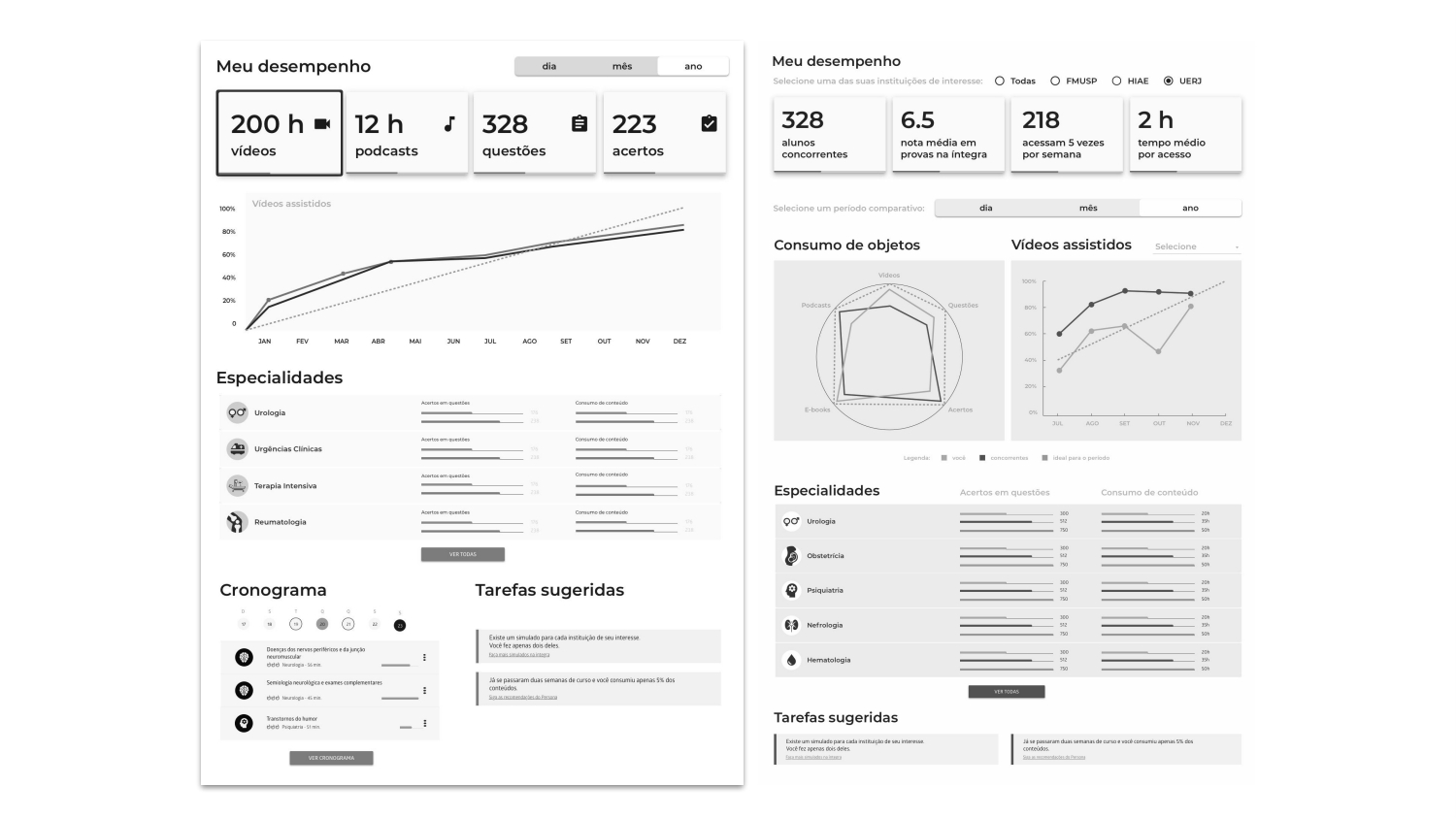
Graphs
In the current interface at that time, students could select to view performance according to 3 institutions of interest
in which they would take the aptitude exam.
According to this selection, they would visualize:
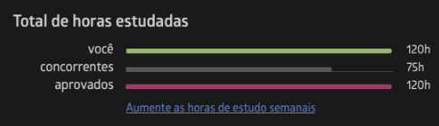
- Total hours studied , total hours studied by competitors and total hours studied by approved
candidates (data related to approved candidates was not available, as there was no such information in the database);

- Percentage of objects consumed , percentage of objects consumed by competitors, and percentage of
objects consumed by approved candidates (data related to approved candidates was not available, as there is no such
information in the database);

- Exercises completed , exercises completed by competitors, exercises completed by approved candidates
(data related to approved candidates was not available, as there was no such information in the database);

- Correct answers in simulated questions , correct answers in simulated questions performed by
competitors, correct answers in simulated questions performed by approved candidates (data related to approved
candidates was not available, as this information was not available in the database);

Points of attention:
- Two messages related to student consumption and proficiency, with practical tips on how to improve performance.
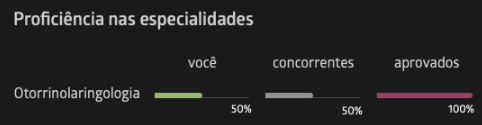
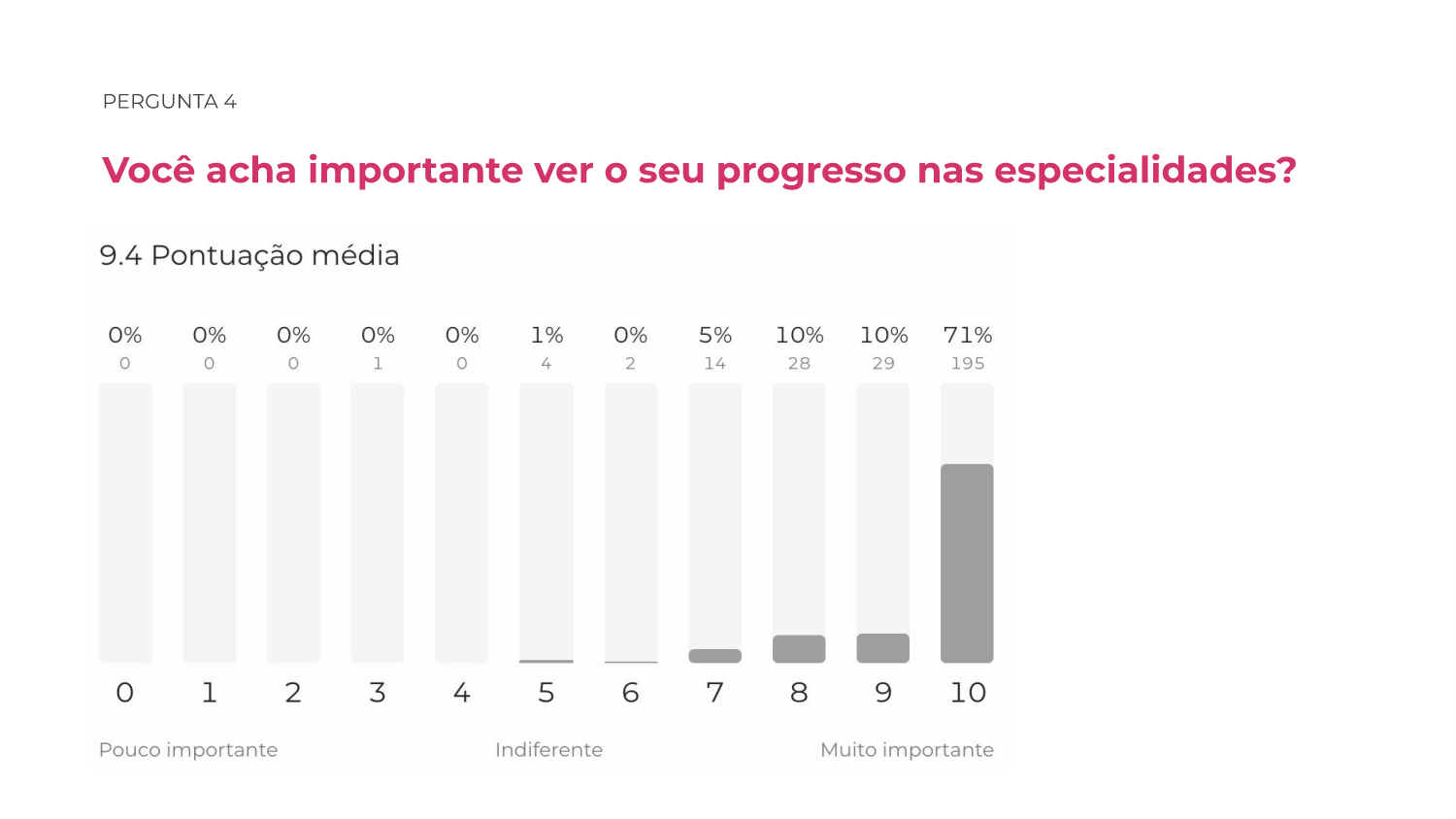
Proficiency in specialties:
The numbers compare the performance of students, competitors and approved candidates (the
data related to successful candidates was not available, as there was no such
information in the database).

Pace of study:
- Metric of the content consumed in relation to the total content of the course.
The figures compare the performance of students, competitors and successful candidates (the
data related to successful candidates was not available, as there was no such
information in the database).
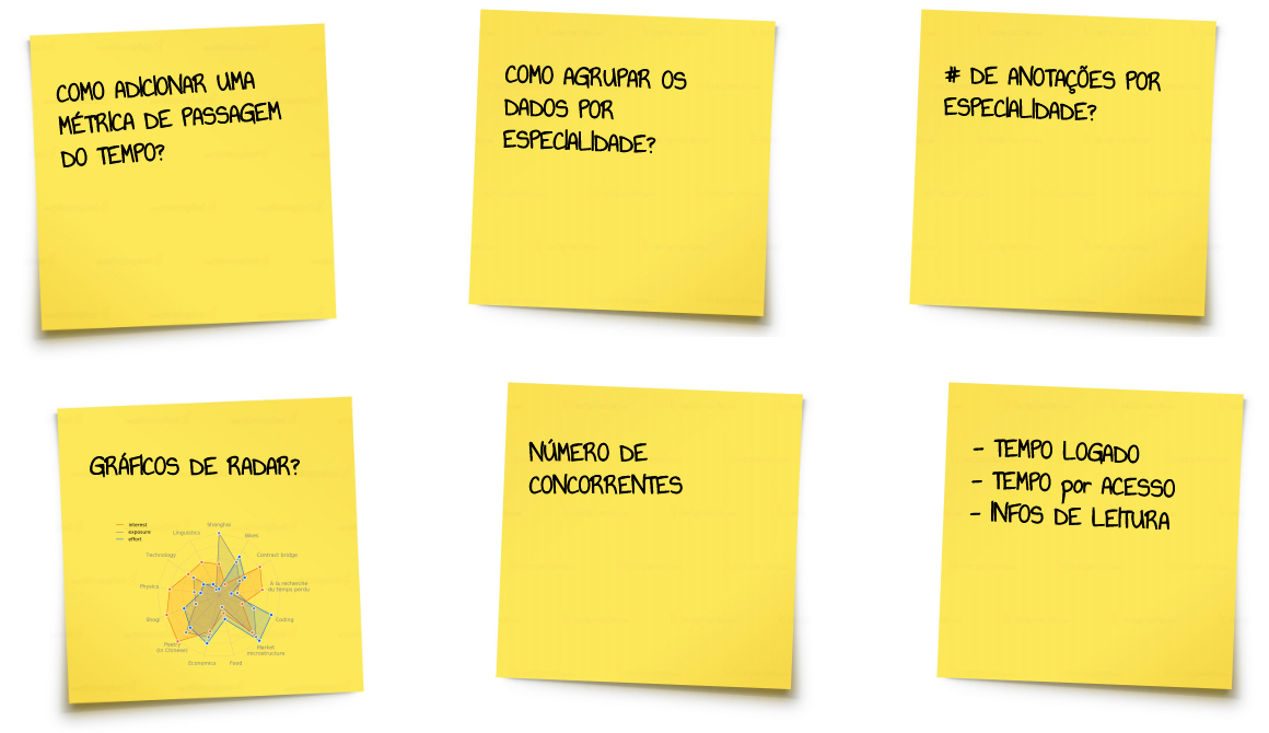
Workshop
During the workshop for project briefing , we use the CSD matrix for envisionar the challenges of the project. Through
this methodology, we aligned the certainties, doubts and assumptions that would guide my research with users in the
future.
Certainties

Doubts
Suppositions

Pesquisa
I have collected feedback from the platform users through a research form, therefore understanding their needs and preferences while using the performance graphs functionalities.


Research Insights
- Keep the comparison between the student and the competitors;
- Main data to be presented;
- Maintain progress in each specificity;
- Student preference charts;
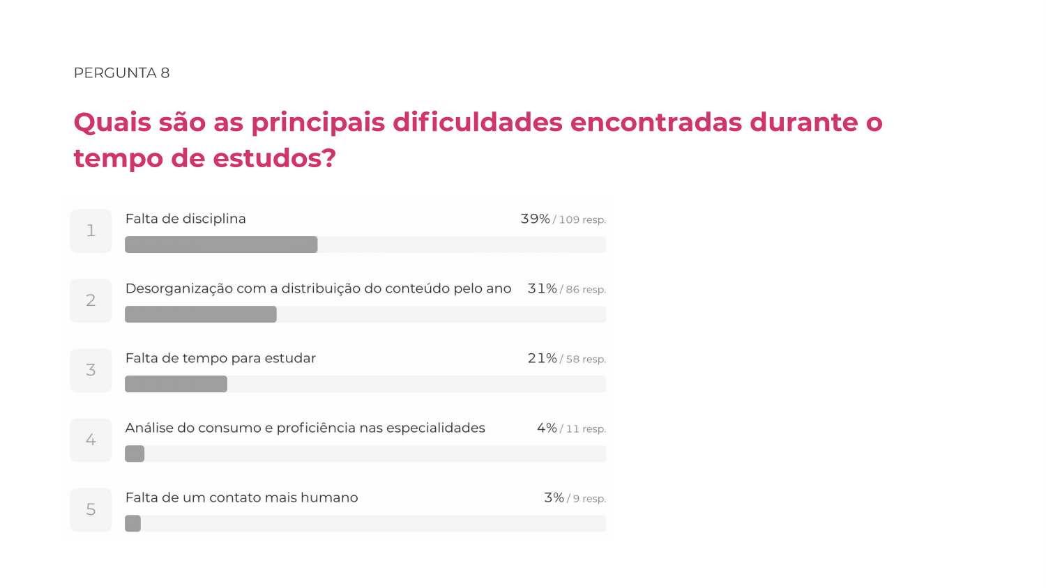
- Main difficulties: lack of organization and discipline of studies.
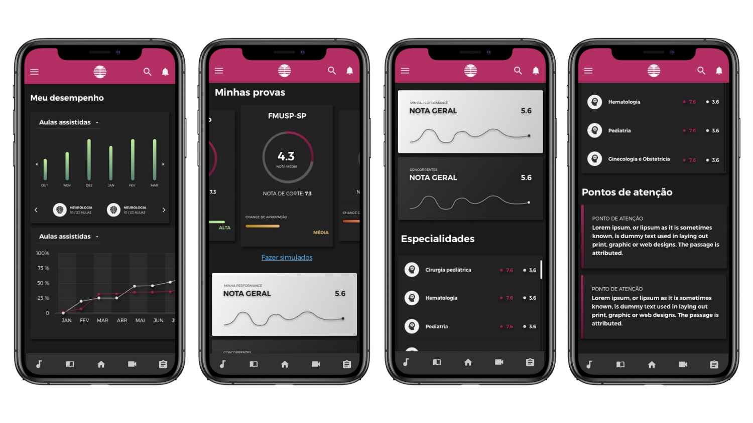
Wireframes

Prototype Version 1

Prototype Version 2

Prototype Version 3

Prototype Details
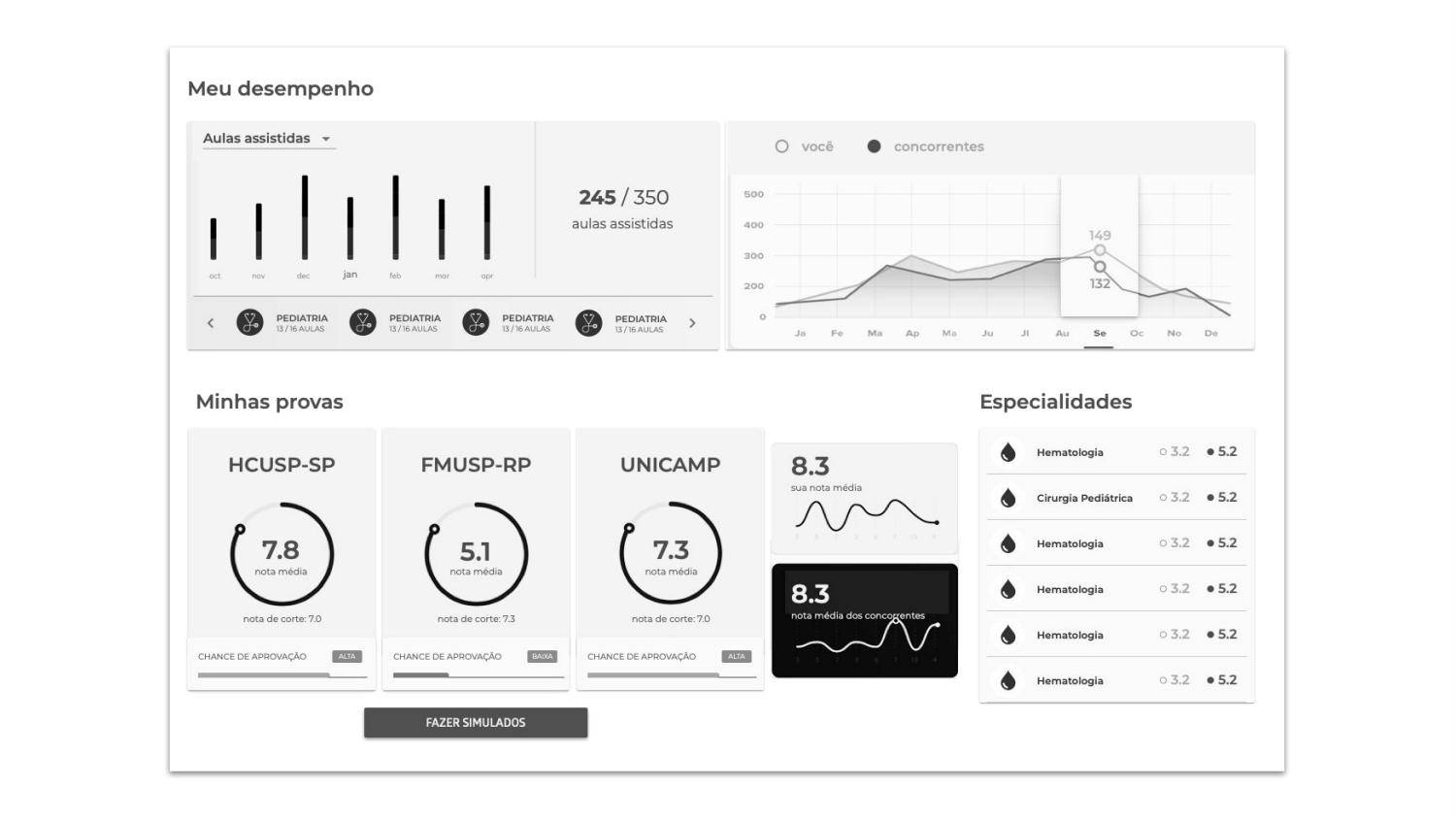
- Magenta represents all student data, while white represents competitor data;
- The graphs can change color (green, yellow and red) to represent the probability of passing the exam.
- General notes and grades for each exam.
- Tips on what and how to study to improve overall performance.